Most print delays don't start on the press. They start with a file: a logo too close to the edge, an RGB photo, a font that went missing. Every one of these is caught in prepress, but each one costs a round of emails. Run this checklist before you send artwork and the job goes straight to plate.
The checklistTen things to check
Set the document to the exact finished (trim) size, not A4 "to be scaled later".
Extend backgrounds and images 3 mm past the trim on every side, so there is no white sliver after cutting. For boxes, follow the dieline.
Keep text, logos and anything important at least 3 to 5 mm inside the trim line.
Build in CMYK, not RGB. Bright screen greens, blues and oranges cannot all be made from four inks and will shift.
Dark areas with too much ink stay wet and can rub or set off on the next sheet. Keep the four inks added together under about 300% on coated paper, lower on uncoated.
Set small black text in 100% K only. Rich four-colour black on fine text can look blurred if the plates move slightly.
Use about 300 ppi at the size the image will print. Below about 150 ppi it looks soft; enlarging a small image does not add detail.
Embed fonts or convert them to outlines. Keep text at 6 pt or larger (8 pt if it is reversed out of a colour) and lines at 0.25 pt or thicker.
Name Pantone colours exactly. Put foil, spot UV and emboss on their own layer as a 100% spot colour named for the finish.
Send a print PDF (PDF/X-1a or PDF/X-4) with crop marks and bleed included. One file per job, pages in order.
01 · Bleed and safe zoneWhy the edges matter
Sheets are printed larger than the finished job and cut down. Cutting is accurate, but not to the hair. Bleed gives the blade somewhere to land so colour runs right off the edge, and the safe zone keeps your text from being trimmed or crowding the edge.
02 · ColourScreens glow, paper doesn't
Your screen makes colour with light (RGB). The press makes it with ink on paper (CMYK), which has a smaller range of colours. When RGB artwork is converted, the brightest colours get pulled in, often looking duller. Converting yourself, before you approve the design, means there are no surprises at the proof stage.
If a brand colour has to match exactly, quote its Pantone number. We can mix it as a fifth ink rather than building it from CMYK.
03 · Check it yourselfUse Ink Lab first
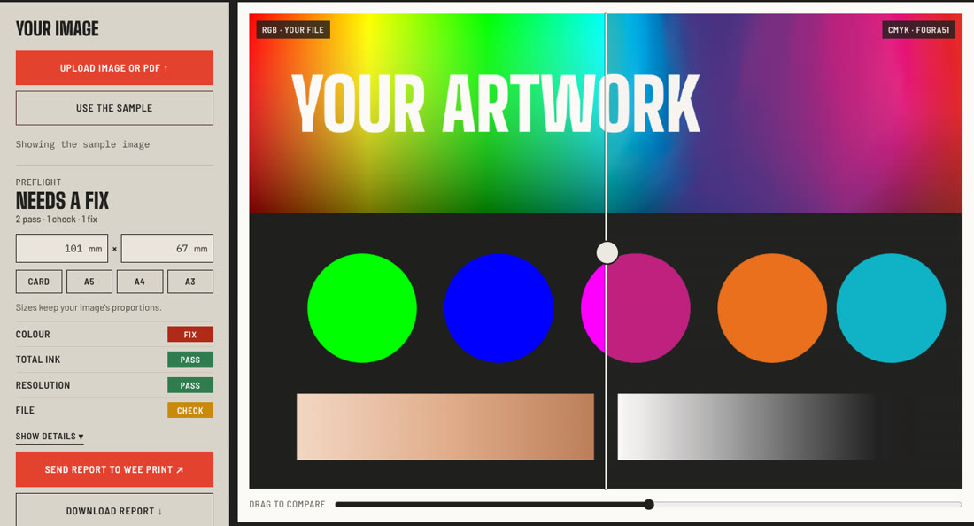
Our free Ink Lab tool runs most of this checklist for you. Upload your image or PDF and it shows how it will look in CMYK, maps where the total ink is too heavy, checks image resolution at your print size and, for PDFs, checks pictures and fonts on every page. The file stays on your device. When you're done, send the report to us on WhatsApp with one click.
04 · PackagingBoxes have one more rule
For cartons and boxes, the dieline is the map: it shows the cut lines, fold lines and glue area. Keep it on its own layer as a named spot colour (for example "Die"), set to overprint, and never move or resize it. Put artwork under it with bleed past every cut edge, and check that panels read the right way up once the box is folded. Our dieline tool lets you fold a box in 3D to check that.
05 · Before you hit sendAsk for a proof
Even a perfect file can surprise on paper. For colour-critical jobs, ask for a printed proof, or a press check where you approve the first sheets on our floor. It costs a little time and saves a reprint.
Not sure your file is ready?
Send it over. Our prepress team checks every file before it goes to plate and tells you what to fix.